
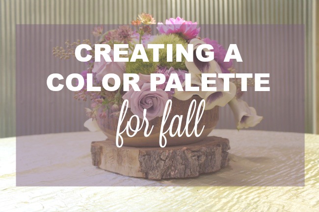
Choosing a color palette for your Fall event
Though every component that goes into your event will have an impact on the overall feel, few choices will create the complete mood like your color palette. Yes, choosing the tones and hues that will bring your event together can be a daunting task, but it certainly doesn’t have to be! Use these tips and tricks to help set the perfect stage for your next event.
1. Don’t limit yourself to two colors.
It’s definitely important to keep your palette simple, but if you limit yourself to two colors, often you run the risk of choosing two heavier colors. Even when these colors are complimentary, not having accent colors or tonal versions of one or both to help with the dimension and texture of your event. You should limit yourself to two main colors when choosing a palette, but leave some wiggle room to really make your event shine.
2. Make one of your main color choices neutral.
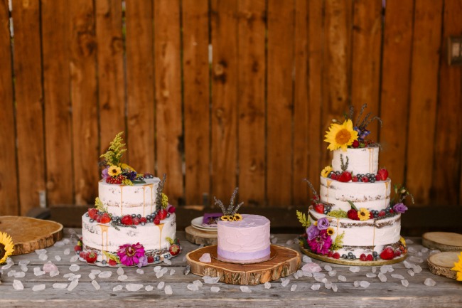
But it’s a FALL party, you say. Fall is all about rich colors! Well, yes, jewel tones and deep hues certainly have their hay day this time of year, but you can’t forget about the need for your guests’ eyes to rest a little. In graphic design, they call this “white space” or “negative space.” Having a neutral as a main color, such as a light beige or a cream, ivory, white, or tan, lets the entire event design breathe a little. Of course, it’s important to choose a neutral that contributes to the overall theme and feel you’re going for. If it’s a bright, Moroccan-themed wedding or party, you’re probably not going to want stark white or satiny ivory as your neutral. If it’s a soft, muted pastel palette you are trying to pull off, throwing in an orangey-tan probably isn’t your best bet. But if you choose a neutral that is tonally on cue with the rest of your palette, you give your bolder color choices the opportunity to really pop and be appreciated just a little bit more.
3. Don’t be chained to seasonal “color rules”
If you are throwing a soiree in the Fall, but aren’t a fan of oranges, reds, and deep yellows, don’t force yourself into that palette. You can choose colors that resonate better with you and simply tweak them to make them more seasonally appropriate. For example, if you’re drawn to mint, but you’re throwing a party in the winter, try a dusty sage instead. Or, going back to our fall example, maybe you don’t dig reds, but a muted burgundy is really pretty to you. That works just as well! Choose some colors that you love, then look for different shades that have little more of that “fall” vibe.

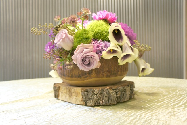
4. Try a monochromatic palette
Maybe you don’t feel like going through all the trouble of choosing coordinating colors from different parts of the color spectrum, but you still want a cohesive color scheme that doesn’t consist of two colors for your shindig. A monochromatic palette consists of different shades of the same color. So if you start with an olive green, the palette would work its way up to a dusty sage, or if you started with a muted rose, the palette would wind up at a burgundy. To create the monochromatic palette that’s right for your event, carefully choose the color you want as the headliner for the evening, then either subtract or add white to create the different shades. Do this a few times until you have about 3-5 shades that gradually get lighter or darker from your main shade, and tada, you’ve got the monochrome look that will inform the rest of your event design choices.
5. Get specific with your colors.
Once you have a palette in mind, make sure you’re specific and certain. Pin inspiration boards on Pinterest, print out pictures, go searching for the pantone codes if you’re feeling extra ambitious. That way, when you take your palette to the event pros you’re working with, everyone is on the same page. If you’re working with multiple vendors, this is especially important to make sure everyone shows up to the event with decor, floral, lighting, cake decorations, and linens that go well together. There’s nothing worse than describing your palette to your pros only to realize come show time that your bakery had a different vision of “Sort of Jade green but not necessarily that intense” than your decor company did.
We could spend days talking about what goes into a great color palette, but these tips should help cut through some of the fog and create a mood for your Fall event that will wow your guests and leave them asking when you’re throwing another bash. Oh, and if you’re throwing a Halloween party? All bets are off – go wild and get ghoulish with it!
Don’t forget to connect with us on Facebook, and if you’ve already found your perfect palette but are looking for the pros to help pull your event ideas together and create a unique, beautiful and memorable experience for your guests, we’d love to talk. Give us a call or email us at info@designworksevents.com and let’s get designing!